Pages

Tuesday 31 May 2011

Simplified Fresh

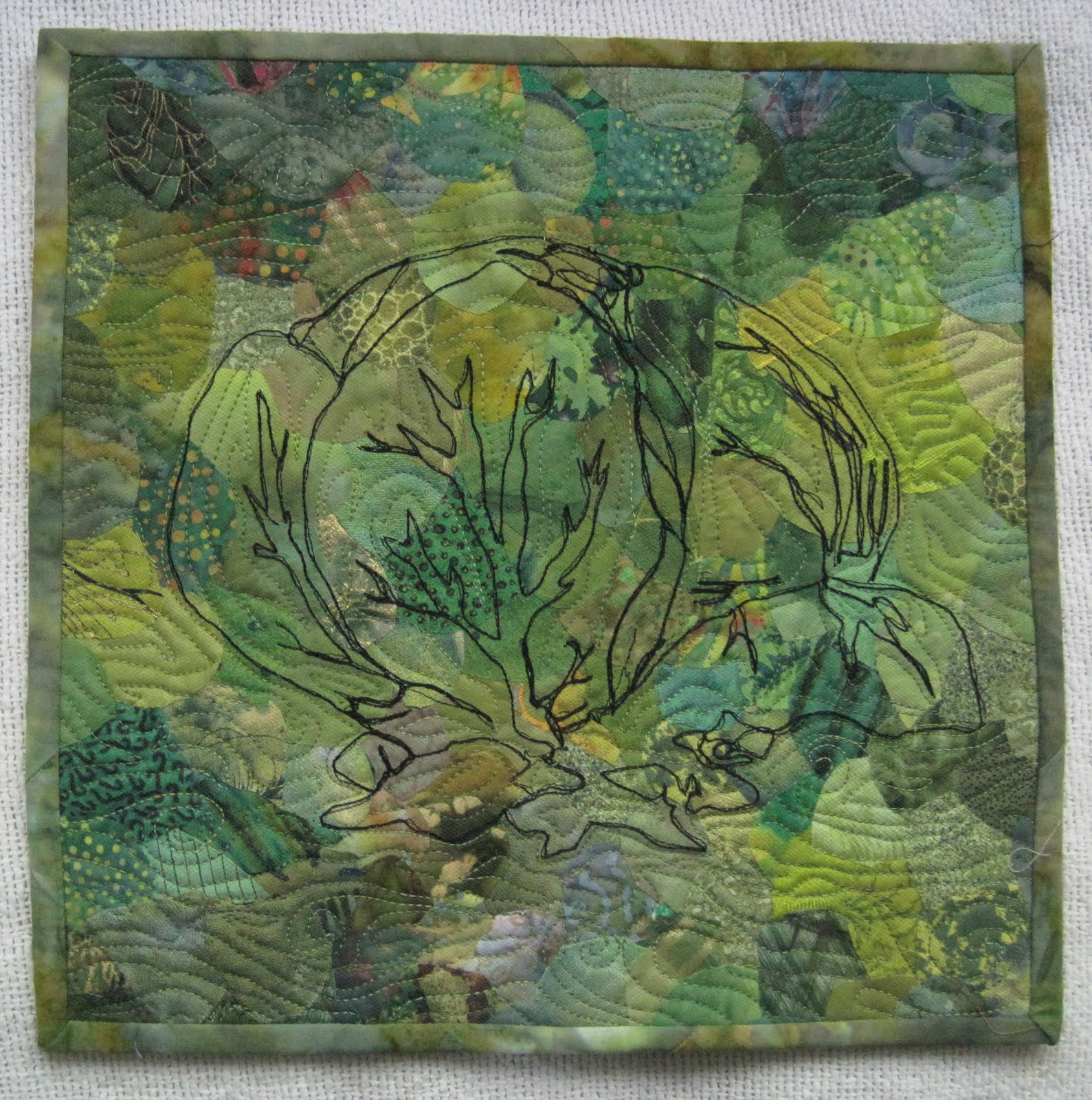
A typical spring in Hudson would be the very definition of" fresh ." But this April when I set out to complete my piece, there was not a bud or leaf in sight. Only grey skies and a faint promise of the blue scilla that would normally blanket the lawns and gardens with colour. (Thanks Linda for the early Elizabeth Barton tip as they were much in need.) I thought that a very reduced palette of stoney greys against a small quantity of any saturated colour would help make the seedlings in the spring light pop. Deciding to take a very minimalist outlook and a spontaneous approach to tequnique was a fresh fun way to work. The edges were left loose and frayed which I think adds an organic feel to the composition. A sample book of striped organza also came in handy. To give a possibility for soft backlighting the finished piece was mounted on plexiglass. It was sold at our vernissage to an artist who saw only the composition and no fields at all in there.
In the end I enjoyed having the challenge and found the camera a useful tool that I will use more while I am back to work to help keep the juices flowing. By contrast after a solid month of rain the enormous leaves and gigantic blooms have to be seen to be beleived. Michele

Fresh Flowers

Since I am relatively new to fiber art quilting, I am dedicated to trying different techniques for each challenge (which has become a challenge in itself). My "Fresh Flowers" were inspired by a class that I took from Noriko Endo. I drew my sunflowers on Golden Threads Quilting Paper then stitched it onto my quilt sandwich...design and quilting done at the same time. After pulling off the paper, we were encouraged to paint, stitch or color as desired. I was also experimenting with Zentangle doodling (A method created by Rick Roberts and Maria Thomas, of Zentangle, Inc.) and so I combined the two techniques. I painted the flowers and banner with Fabrico markers andthen free motioned the leaves (no paper and no marking).
I really enjoyed combining these techniques to express this theme. It was "re-freshing" to try new products and to experiment with "fresh" ideas to get a "fresh" new look to my art!

Mr. Clean

I was rather stumped for a 'fresh' idea until Dianne combined her portrait piece (our guild challenge) with a 12 by the dozen challenge. A 'Fresh Portrait' was born.

The fresh scent of a clean house is heavenly whether it is enhanced by Mr. Clean or another one of your favourite products.

Mr. Clean is done entirely with thread. The background fabric has a sparkle in it which adds to the theme of sparkly fresh and clean.

This is my second thread painted project and I am hooked. I could use guidance if anyone has any experience. The procedure used was to draw the image on washable sulky and then stitch directly on to that. Then it was overlayed onto the background fabric and quilted in place.

Fresh Greens

For some reason, the photo didn't appear when I posted this the last time, so here it is again.
As soon as the theme was announced, I had this image in my head (so did Hilary apparently! Great minds think alike). The background is made of small collaged pieces of fabric, covered with tulle. The lettuce is bobbin-stitched with heavy thread from the back.

FRESH - lettuce!

Sorry about queering the patch for some of you by responding so quickly with my immediate thoughts on hearing the theme.  As it is I went with the first thing that came to mind, although I did consider 'fresh as a daisy' (and have some nice daisy pictures), fresh air, fresh water (have always wanted to do a thread painting of a water fall).


Finding the fabrics was a bit of a challenge as I wanted to use only commercial fabrics and green seems to be my least favourite colour judging by my stash.  I realized I would need to add some lime green to give it some life but had to tone the one I found down when it came together as it was too lively.  Hurray for Fabrico pens.

It was quite a learning curve in construction as the template was drawn out on Bondaweb, pieces numbered and then scanned (for a master copy).  I cut out the individual pieces and ironed them to the back of the fabrics, cut them out leaving allowances for overlaps and removed the backing papers.  I now realised I had lost the possibility to line anything up.  Even having a tracing paper with outlines drawn on laid over the background wasn't good enough.  I also forgot that the whole design would be reversed with the Bondaweb and that didn't make things easy either!  I got the outer leaves in place which was the correct order anyway (always work from the back to the front) but the zillion little pieces towards the centre left me scratching my head.  The solution turned out to be fairly simple - after removing the Bondaweb papers pin them to the top of the fabric pieces and then line up the pieces like a jigsaw - easy peasy.  I ironed the pieces together in small groups and then altogether.

All in all, I'm pleased with the outcome - especially getting it done in two days!

Hilary

Spring


I did have trouble with this word and with spring emerging here I kept coming back to that theme.  I thought that I would try this free form style but found that it was really hard to cut wonky strips - I guess I'm hardwired to do straight lines!  The fabrics have been coloured in all sorts of ways  -with tsukineko inks and razor mousse, gelatin plate printing, leaf printing, various dyeing.....

One of my Japanese maple (not the one the leaf is from) turns this beautiful burgundy in the spring, my yellow primulas are looking happy,  the ferns are doing well and taking over.   And of course, there is that lime-y green that is so prevalent at this time of year.  

Hopefully a happy piece.


Fresh ... air and peace

I almost feel like a bit of a fraud posting something so simple in it's construction - painted fabric with simple machine quilting, but arriving at this point was a long process.

For a long time I couldn't let go of the idea of "minty freshness" and toothpaste (Maybe the stripes remain?) but wasn't able resolve a design for this. Then that Elizabeth Barton blog article popped up and I was amazed at how different our interpretations of 'Fresh' were. For some reason the differences validated my ideas and I began to doodle both physically and mentally. Fresh for me relates to calm and peace, I could hear waves gently lapping ........ then I remembered my daughter being delighted by the action of the tide making 'her' beach fresh for her to play on each day whilst on holiday.

I had intended to machine quilt foam along the 'wave crests' then heavily embellish the 'sea' (Hence the teaser earlier this week.) but neither of these things happened. I reached a point of calm and peace:


'Fresh.'


The faces of my children and all children symbolize the meaning of 'fresh' for me - fresh, young, new, innocent - always beautiful.
The idea that I originally had was to interpret a photo of fresh leaves after the rain taken by a friend of mine in Hiroshima Prefecture in 2005. That changed when a few of my colleagues mentioned that they wanted to hang their 'Fresh' piece in our recent Text'art exhibition and time was not on my side.
I enjoyed the spontaneity and abandon with which I made this piece - it has a lightness about it which I found very 'refreshing' especially in the context of the subject matter of my work in general.
Good luck with the next challenge.

Fresh Greens

As soon as the theme was announced, I had this image in my head. The background is made of small collaged pieces of fabric, covered with tulle. The lettuce is bobbin stitched with heavy thread from the back.

FRESH rain after a drought


I thought this would be appropriate coming from Africa which is such a land of contrasts - how wonderful it is to feel and see the rain after a long, dry spell! The joy of seeing rain falling onto a parched land. I used hand dyed brown toned fabric for the background and used angelina to give a slight shimmer of the water, then I layered organza on top of this, quilted the whole piece and burnt through the organza in various places to show the hard, brown earth below the surface of the water. The beading, which I did last was the raindrops falling onto the puddles.

Fresh

This little piece allowed me to play with two of my current preoccupations: square-in-a-square and colour transitions.

For square in a square: regular or irregular? pieced or fused? are rectangles allowed to play? does every large shape require a small shape inside it? do the shapes overlap or do they form a grid? can a shape be created by a stitching line, a cluster of beads?

Colour transitions can be tricky. How much "Fresh" green is needed to make a "Fresh" statement?

How much variation of stitch, colour, shape works? What is the balance between creating interest and creating disunity?

I was quite stumped about working with the theme "Fresh", but when I used it as a vehicle to play with some of these questions, I had a lot of fun with it. Perhaps one day I will be able to work it up as a larger piece. The cloth is mounted on a thicker stretched canvas, so I had to pay attention to the sides as well as the front.

Fresh - GnT

I really struggled with this theme for some reason - inspiration refused to strike. As usual, I was saved by my husband who suggested that there is nothing more fresh on a summer evening than a gin and tonic! It's rather a murky gin, but I was really pleased with the bubbles! Fused fabrics, stitched before and after layering. Cheers everybody!!

Strange being on this side of the Atlantic and being only the second person to post! My life is rather fragmented at the moment ................. ah, there's a thought!!

FRESH - WORK IN PROGRESS

As you know, I am working a series within a series, i.e. all my pieces are based around life within Africa and will ultimately hang together as one piece. How, I have know idea at this point.  Because of this my theme piece for this challenge is 'Graffiti and will become the front label for the whole series.  So, I lied when I said I was finished as it will be a 'work in progress' until I know the final theme.


The background design was created by using a freezer paper template and discharge paste.  The rest is  fused painted fabric and 'graffiti' with more to come.  It was difficult positioning the six themes not knowing what is coming, but at the same time making it look as if it was finished, so I decided to stop at this point for the time being.


Here are the six pinned together to give you an idea of where I am heading.

Monday 30 May 2011

Ta-da

Spring has sprung, Fresh is done!!
You can probably hear the frenzy in all that.  And Wednesday I'm on a studio tour being run by our guild.  I don't think it's been so spic and span since the last one!

next challenge................

drumroll......................

the next challenge title is ..................


FRAGMENT(S)


go wild....................

Sunday 29 May 2011

Fresh - a late teaser

I've had this photo to post for a couple of weeks but it has fallen down my 'to do' list - so consider it as a late teaser! These are the bits that got away:

Saturday 28 May 2011

Drakensberg Wonders

We have just returned from a week in the Drakensberg Mountains (one of our heritage sites) at a time share and being autumn the colours were amazing so would like to share a couple of pics.


...... and yes we had snow.   We also had frost, rain, and sunshine and a very dedicated fly fisherman (my better half) who only he would consider trying his hand in this weather!!


Friday 27 May 2011

Hudson Medicenter gets new minigallery


Thanks to the insightfulness of our friend Heather, a minigallery wall of rotating art will be featured in the waiting room of our brand new medical center building. From the picture in the last post you can see that Heather's large new piece that she has just installed beckons from the landing beside the elevators. It fits magically into its new space and can be enjoyed from many levels. I have had the honour of being selected as the first featured artist for the minigallery. This space has been lovingly dedicated by Peter Lombardi to the memory of his wife Rosemary , our good friend and a talented quilt artist. Her family has worked tirelessly this winter in the completion of this modern new facility to benefit our community and a successful opening was held last week. Many thanks to Heather for taking the time and effort necessary to make this space available for artists and the surrounding community.

Friday 20 May 2011

The Beast


Yesterday I was able to install the large piece I made for my husband's new medical centre. The original plan was to have it hanging in the waiting room, but I miscalculated the height of the ceiling, not realizing how much it would be lowered during construction to accommodate heating ducts, etc. I think Plan B is even better than Plan A. It is visible as people mount and descend the stairs, or as they wait for the elevator on the second floor. It was a real thrill to have two workers assemble scaffolding just to hang this piece, then measure carefully and adjust it. I felt like Christo.

It measures about 90" wide and 90" high. The "quilt" is pinned to a double width of charcoal-gray fibreglass screening, held against the wall with a plexiglass bar, top and bottom. Track lighting will be installed soon to highlight it. One of the interesting things about the space is that the back wall, though it appears to be much lighter than the side walls, is actually painted the same putty colour.


My working title for the piece is "It's All That..." I am open to suggestions. At times, it felt quite alien in my studio, being so big, and I sometimes lost confidence that I was on the right track. But I like the colour palette and colour gradation, the irregularity of the edges, its modernity and ambiguity, and how it seems to suit the building as a whole. As you mount the stairs, it takes on the appearance of a stained-glass rose window. I'm calling it a success! Two and a half months in the making.

My thanks to all of you who supported me with your kind guidance and advice. Virtually all of your ideas found their way into the making of The Beast.

Wednesday 18 May 2011

Fresh


I've finally finished (apart from the binding) my 'Fresh' piece. Not sure why, but I found this the hardest one to get inspiration for so far. Maybe it was the additional pressure of the guild show and the Text'Art exhibition all having similar(ish) deadlines. No teasers for the Fresh piece, but here's the work I finished just before. Our youngest daughter, Kat - I'll be interested to see what her reaction is when I show it to her next week while I'm back in the UK.

Friday 13 May 2011

Celebrating 5


I was invited to make a small quilt to celebrate the 5th birthday of a really good German patchwork magazine.  The editor is an old friend from the days when I was working in the patchwork shop in Frankfurt.  I didn't want to do anything with fizz and pop and it took a while to reach a decision but this is my little 20" square contribution.  The shapes are individual and are attached with beads between them and the black quilted background so that they stand proud and represent various fonts and symbols for 5 from around the world. 

Anyway, it is in the post and winging its way to Germany to join all the others.

Hilary

Thursday 12 May 2011

Text'Art at Galerie Ouest

 These are some photos of our show which opened today.  I've already lost one trying to move them around!  I was trying to put them side by side!  


NEXT PERSON

I have been reminded I need to anounce the next person ...........

PAMELA!

Monday 9 May 2011

Quartique Series


I work with a smaller group (6 people) locally, called Quartique, on challenges and as with this group I have worked within a theme to create 'one' piece. The theme had to be stretched in some cases to fit in.  The one theme could not fit in and I had another idea so that was the 'recycle' which I showed earlier.  These are all whole cloths and I have used various surface techniques to get the effects.  They are not in the order of the challenges as they grew as I went along. The challenges were, starting from the left...... fractured(painted applique paper); re-modelling a traditional block = 9 patch; signs & symbols (scorpio); vertical & horizontal lines (used a thermofax on background with +); revolution.
The strips are approximately 6 x 24 inches.

Friday 6 May 2011

The Remains of the Day

Yes! I have finished my Fresh piece. Pressure was on once I learned that some of us are planning to include their Fresh challenge in our upcoming show.

This is just a hint about the palette I have used, and an eye-opener for any of you who think I never mess up my studio. Here's what's lying on my floor this evening:
So looking forward to seeing everyone's interpretation of our theme.

Sunday 1 May 2011

Dyeing!

Our Text'Art show is happening soon  (May 12-17 at Galerie Ouest in Sainte-Anne-de-Bellevue)  and I am dyeing scarves and socks to sell.  Here is a sample of some of them.  They come from Dharma Trading and dye up very nicely.  Some the scarf on the far left is devoré velvet and the others have a silk design on a rayon base.  They really slurp up the dye in a wonderful fashion.